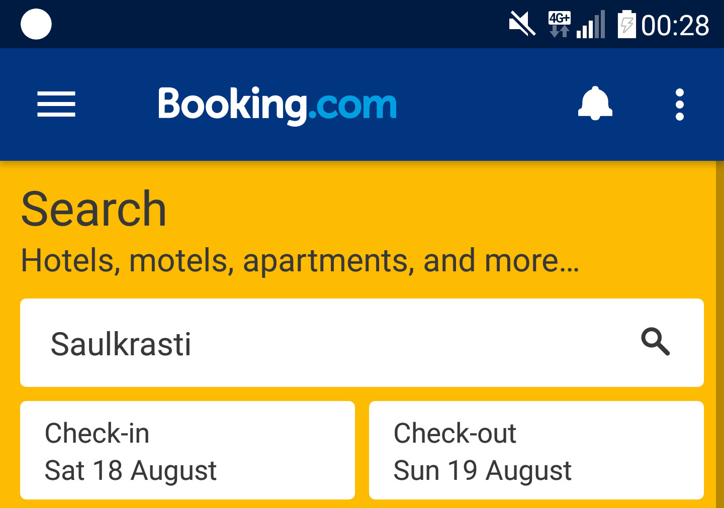
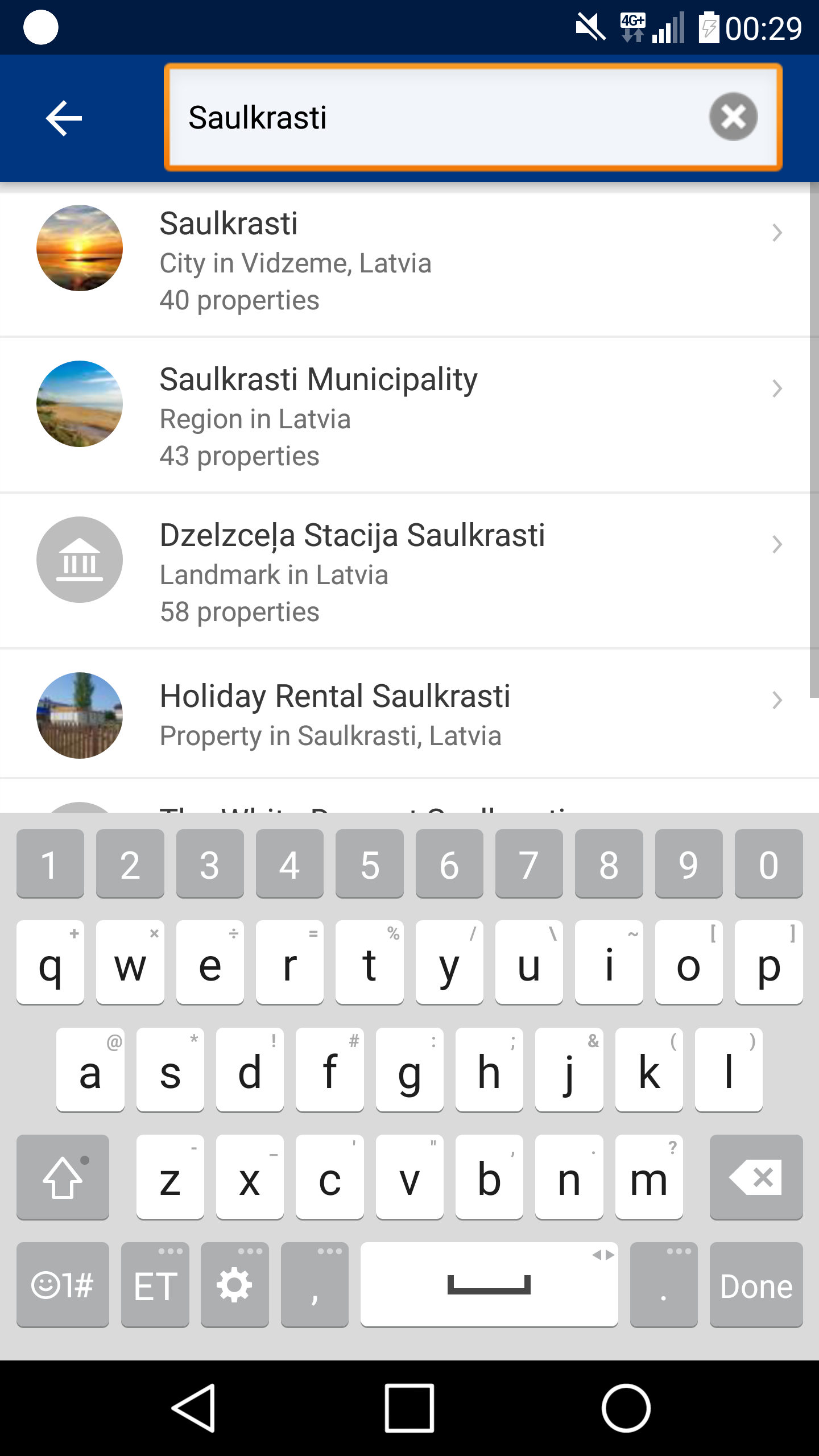
Booking.com APP’s (for Android) most important form field is the search field where you enter the search string for example a city or a hotel name where you might want to stay. It is placed prominently on top of the form view. Still this field has one glitch. Namely after you have entered a hotel name or similar you might click on the magnifying glass icon to get to results. You might even do it for several times before you understand that this will only take you back to entering the search string.
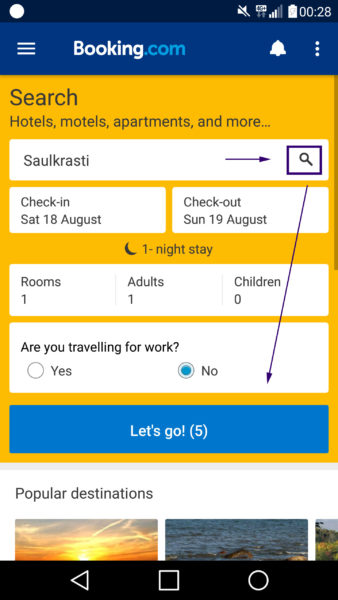
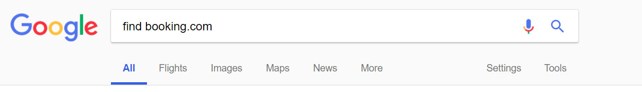
The icon itself represents to user the same design as can be seen on Google search site but it acts differently. Since Google search icon’s interaction is more prevalent in the web than that of Booking.com’s then the latter solution inflicts more or less trouble to its user.
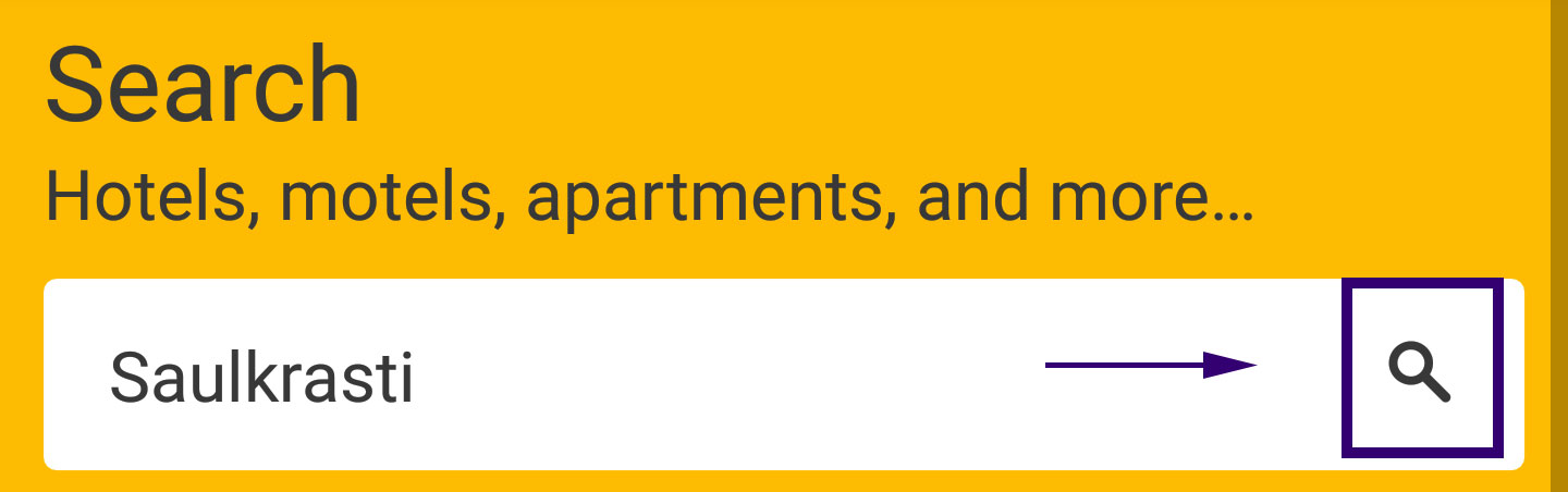
One way to get rid of this problem could be all together to remove the icon, replace it with something less ambivalent or align it to the left side of the form field (as seen below). Of’course a usability test is in place here.
