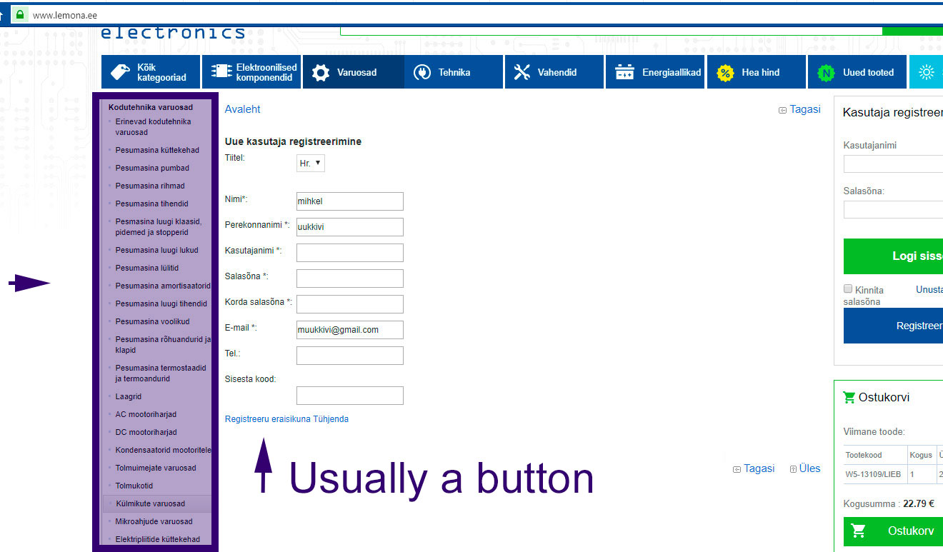
Lemona checkout process has many caveats. First of all the most problematic issue becomes evident when you are not a client but must become one (in order to complete the ordering process) you might find your registration blocked without any further explanations. This happens when you fill in all the required information except for the optional phone number and “what ever” code and push the text link “Registreeru eraisikuna” to register.
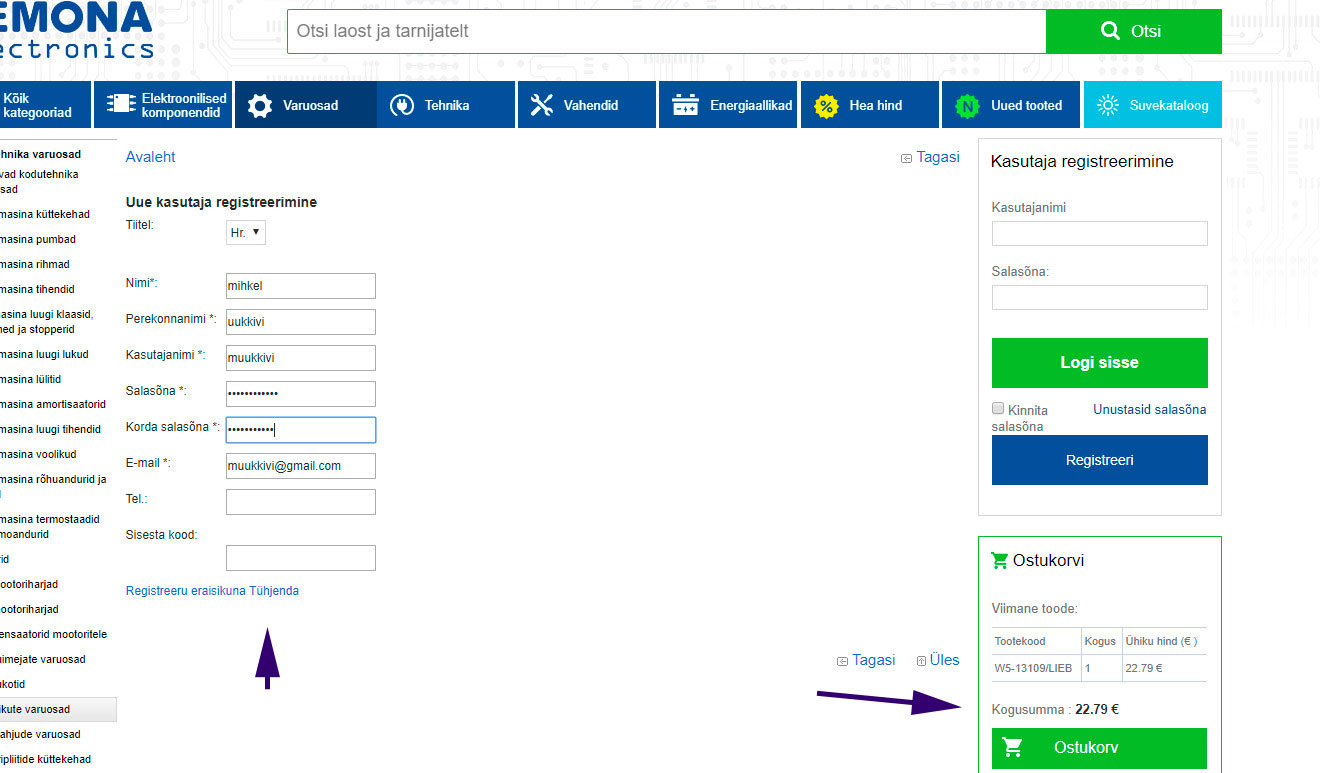
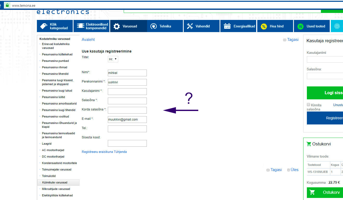
What happens now is a surprise! The same form is displayed after registration attempt without any help or error messages and with the user name and password fields empty. Try again and the same happens. Is the tried user name already in use by someone else or are there any other reason? it is not said and the payment process cannot be completed.
Concerning other issues with this view consider the removal of the overcrowded left menu which provides no extra value for the registering task.
Also primary buttons are usually used instead of text links in case of actions like registering. Secondary action like empty the form – “Tühjenda” can be a link.
The other issue here with buttons is – what’s the need for a button to empty the form fields?
Now let’s continue with the overall checkout view itself.
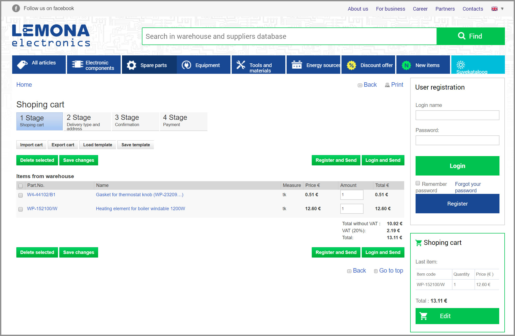
Here at least following problems exist:
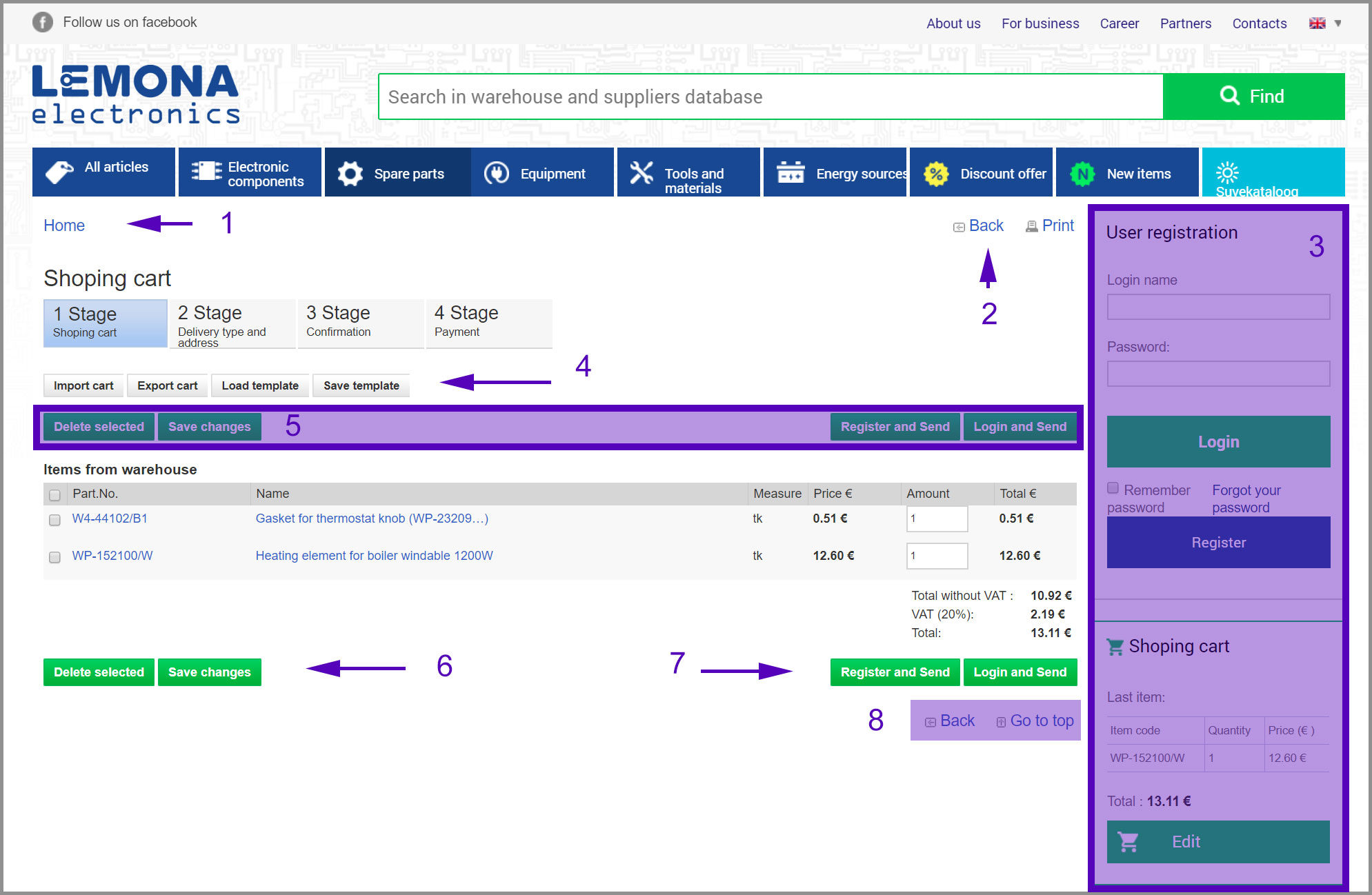
- Excessive content that can draw user attention from the main business process – to get the money from the client as fast and problem free as possible (no 1, 2, 3, 8)
- Redundant action buttons (no 5). Users can and will scroll.
- Secondary actions can be presented in a less visible form, instead of button-like design add those to the top of the menu as icon and text links (no 4).
- No need to display login information in the right side panel as well as the shopping cart block below it adds no value to the shopping cart information presented in the center of the screen (3).
- The “Next” button to the next view is the most important therefore it is primary and therefore the secondary and primary buttons should not be designed identically (no 6, 7).
- Shopping cart is missing one stage – the login/register stage from the progress bar.
- There should be (do not let clients to doubt where to click next) only one primary button not two or more therefore “Register and send” and “Login and send” buttons give users an unnecessary choice to reconsider. The button name can be for example “Login or register”.
- In reality even the top menu can halt user action and company might loose the deal. Therefore for example amazon.com does strip its checkout views from all these unneeded details.
- System must be able to save changes to shopping cart automatically otherwise client might get very pissed off of “cancelled” goods delivered and extra money taken (no 6). You, I guess, want happy and recurrent customers.
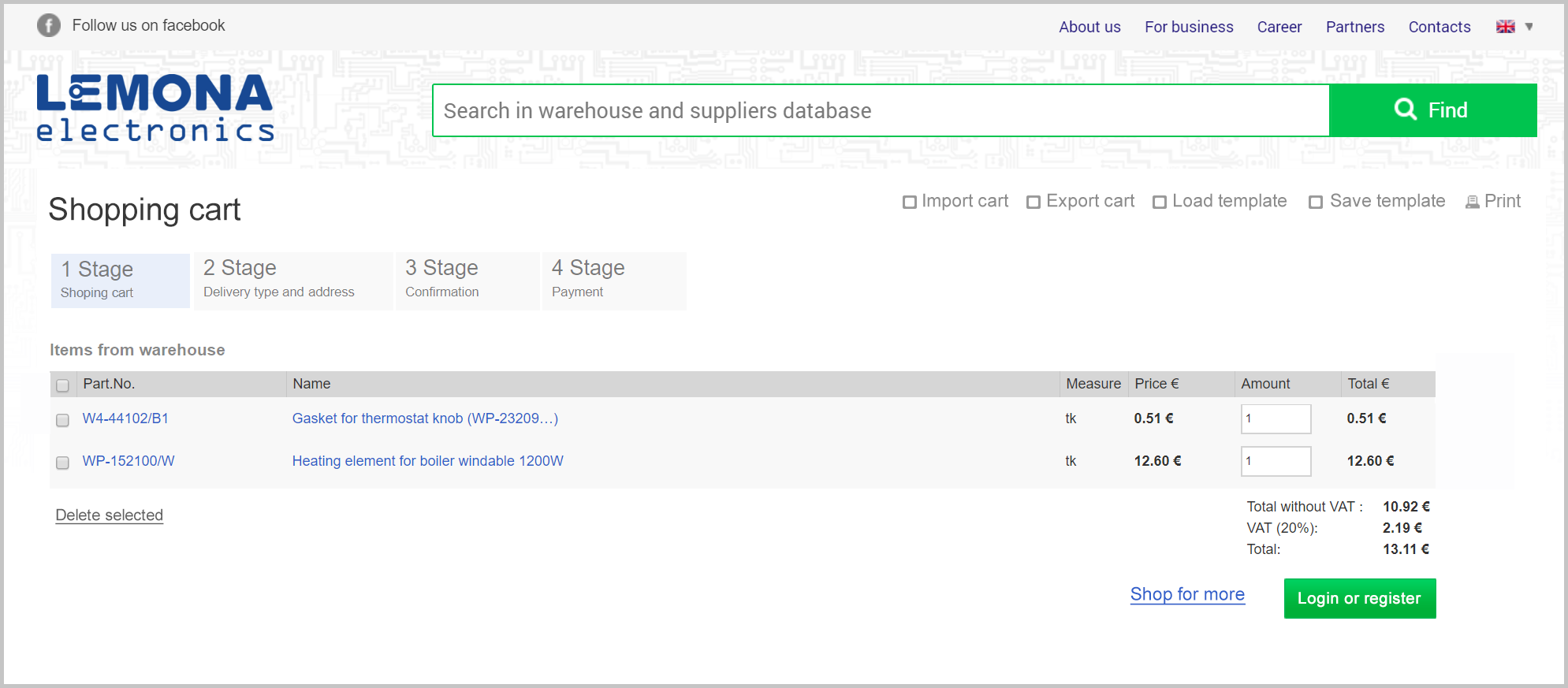
So after some changes we could have following Lemona shopping cart view: