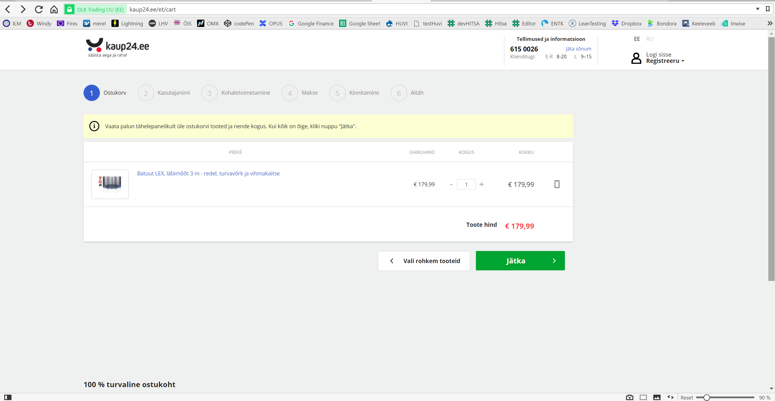
Kaup24.ee shopping cart is again content heavy and therefore hard to gasp. A few details add clutter and slow down the shopping process for getting client’s money as smoothly as possible.
What we could remove without any later regrets are the two redundant buttons at the top of the order details. For better clarity we could also align the two buttons (“Choose more products” and “Next”) to the right-hand side at the bottom of the order details view.
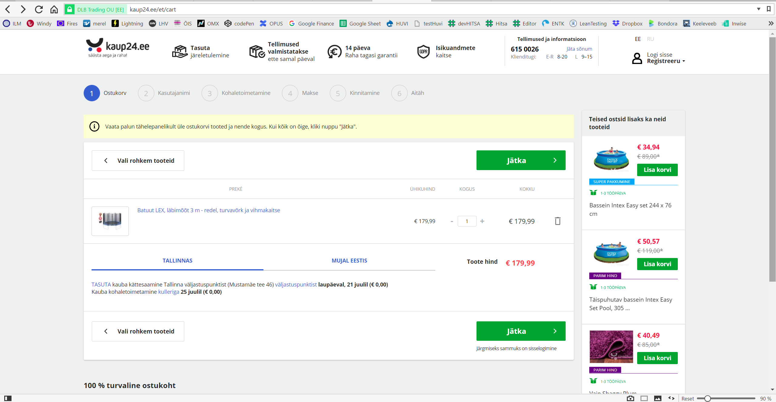
Also in shopping cart there can be but rather not to have any extra information which is not directly related to the order-completing process like showing related products. These products are an excellent addition during choosing products when shopping but maybe not here in the ordering form. So let’s move these.
Now, it is good to know the transportation costs inside and outside of the main city (Tallinn) but the real location for this kind of information is rather under step 3 “Kohaletoimetamine” (delivery). Let’s remove these and agree the information is available in step 3.
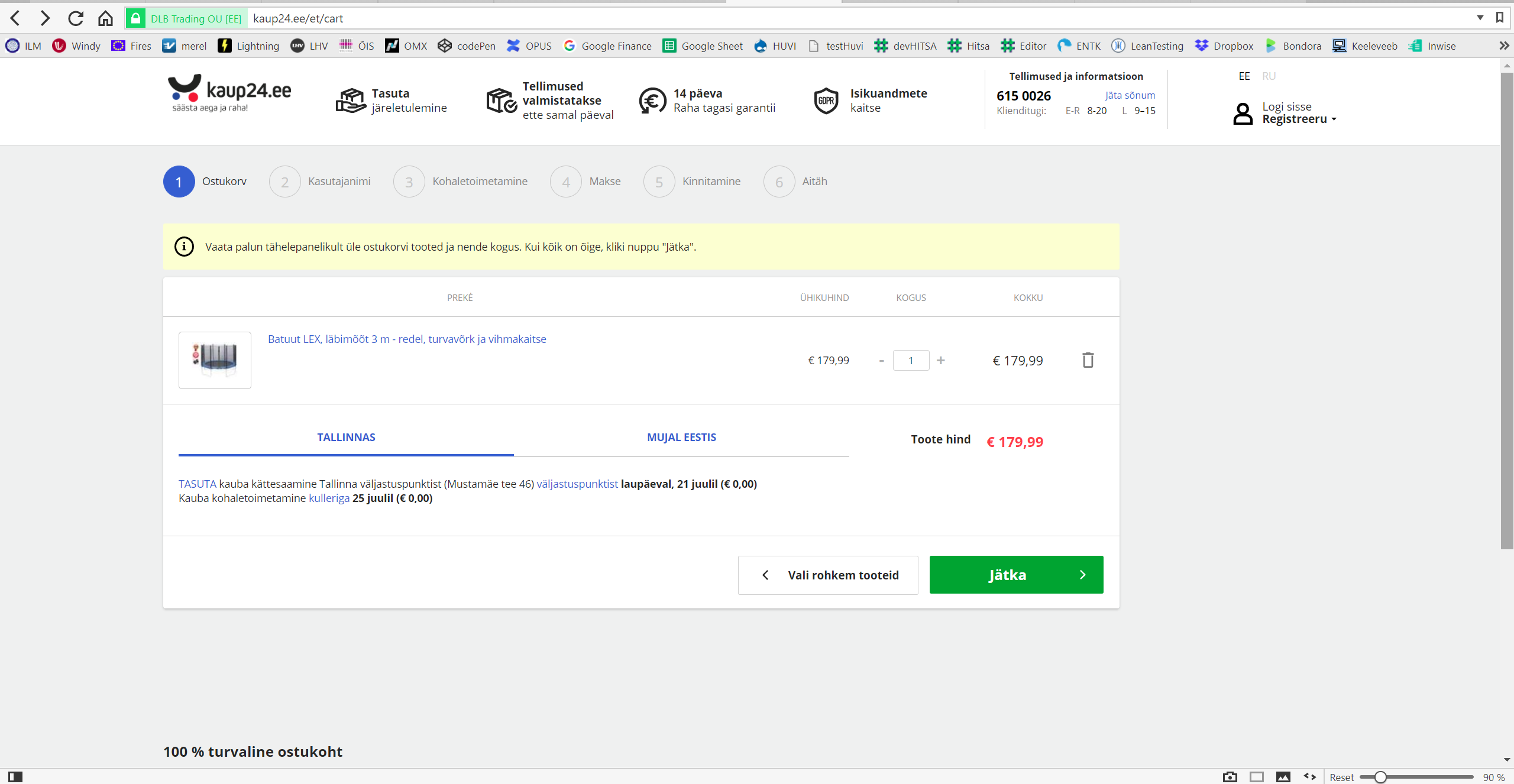
Besides that we removed the top menu marketing slogans like privacy, money back in 14 days guaranteed and so on for these elements add dissonance to the header design. These can be there but a more harmonious alignment of icons and text would be appropriate.
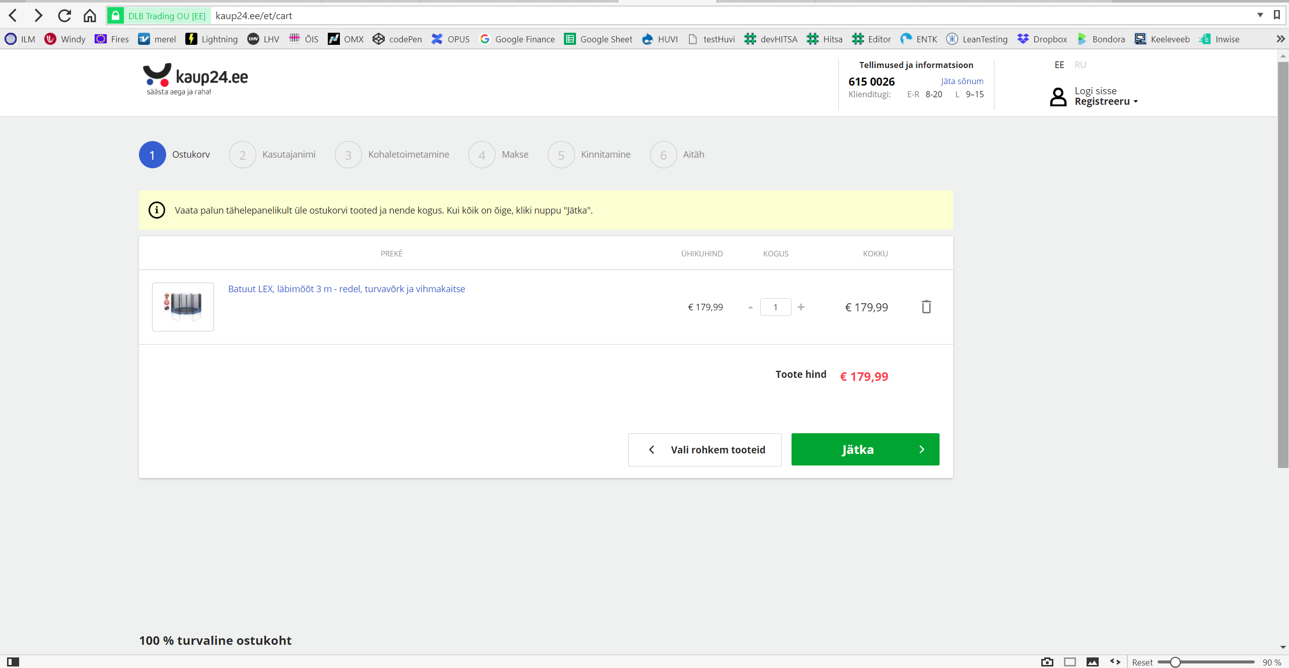
Finally what we can do is to separate the buttons from the order details table since these are steps rather than somehow part of the order information.
Now your attention is suddenly drawn to the important notification on the yellowish background which was not very visible before due the “noisy content” (click on the below image to open a larger picture).