
“Why is it important to design form controls in a conventional way,” you may ask. Well, check out the small loan calculator at Ferratum’s website.

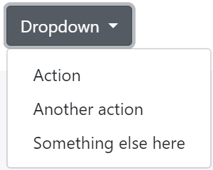
Here we have two form controls which may be misinterpreted. The first one resembles a drop-down button which conventionally when clicked upon opens a drop-down menu with a list of choices:
But in this loan calculator with only one downward arrow it acts like an unfinished spinner button. Spinner buttons are meant to increment or decrement a numerical value by one:

The control also resembles a combo-box of some sort since there is a changeable loan amount field when clicked upon.
Besides there is another shortcoming. If using button as a control element then all the button area is usually clickable, in this control only the area of the amount acts as active link:

Now let’s talk why is this form control important. In its basis it is a form field for entering the loan amount via keyboard and for visually emphasizing the chosen loan in a prominent location. But it is presented in an unconventional manner.
The designer of the company should generate ideas how to display the control in a clearer way. Just a suggestion is to remove the button-like style and use a form field instead:

Second you should notice the slider which has the minus and plus signs to indicate its interactivity – draggability. Unfortunately this again can be mistook for the spinner control convention which is to increase or decrease a number by one.


The easiest solution here would be to replace the -/+ signs with arrows:

For example the following slider design:

There is an excellent article on sliders at Smashingmagazine.com by
Vitaly Friedman.