Check out the search on the Estonian Volkswagen website. Guess what happens when you enter a search term to find local car dealers? Well, you get an “inspiring” result which leads to twilight zone. “Is that any good for the business,” we may ask.
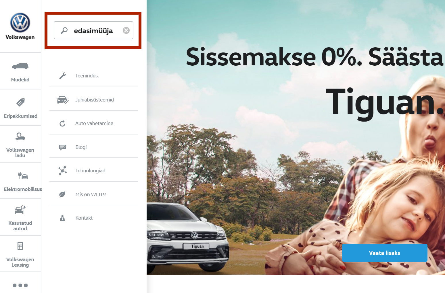
The resulting page after tapping on “Enter” key is as unexpected as for a child opening a Kinder Surprise egg to find out its empty. Besides there should be a button to click on not only the “Enter” key for generating the results page.
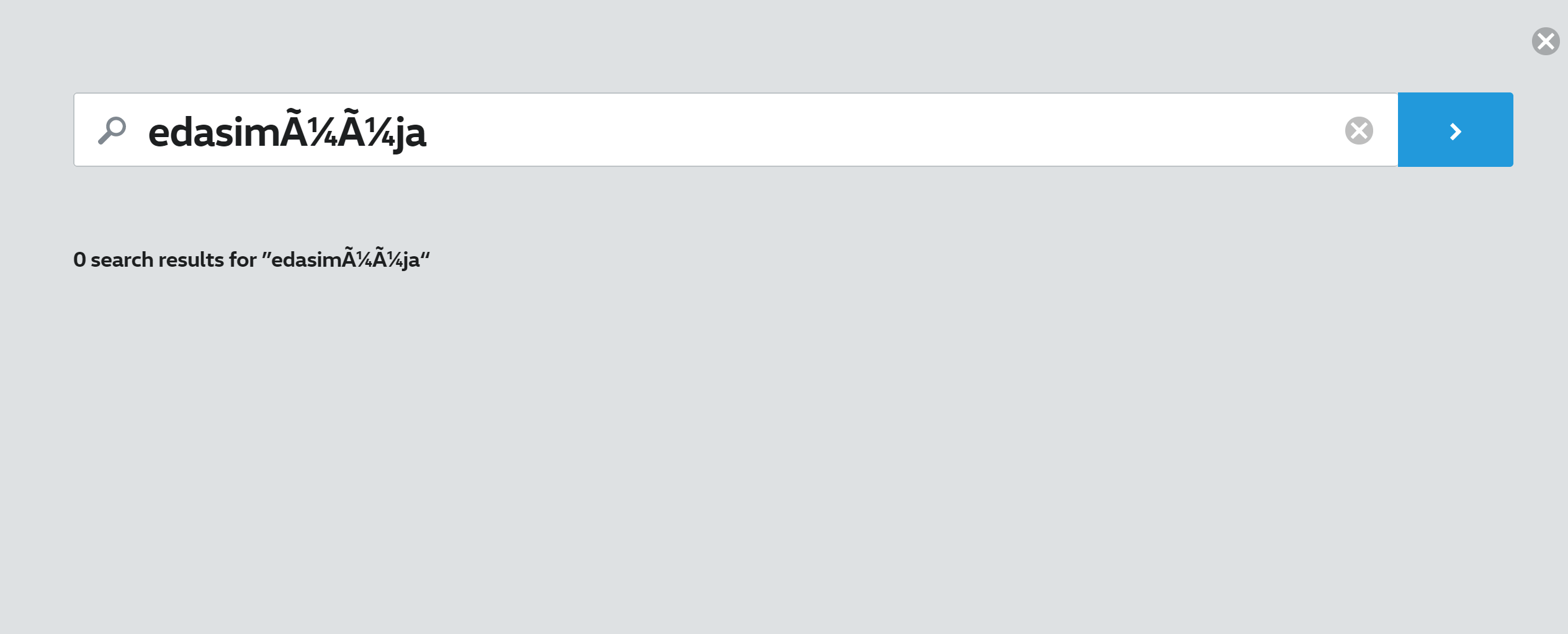
So what could be different? First of all the system should recognize letters used in the native language and use the correct character encoding. Second of all the “no results” page should be a lot more appealing.
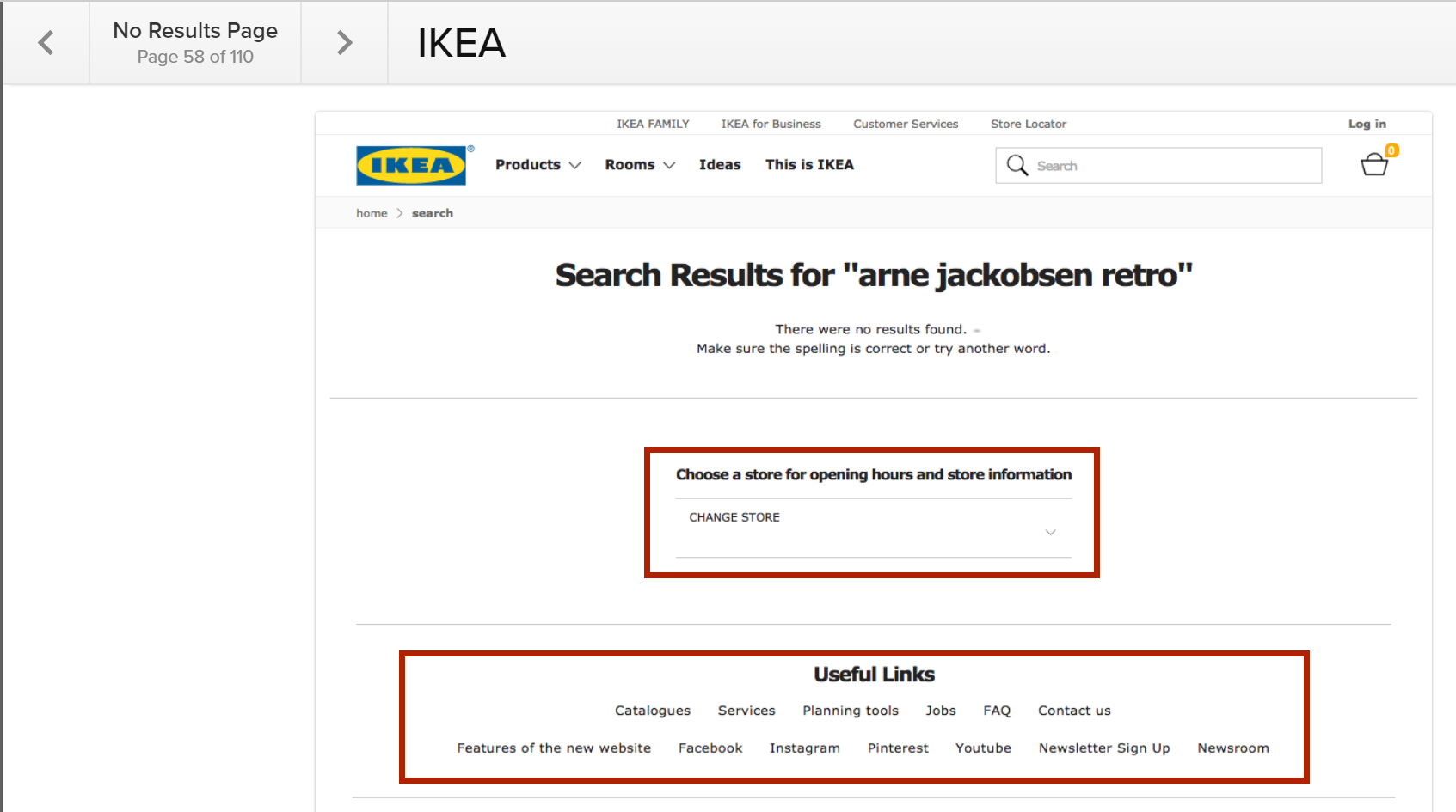
Check out the ideas from website managed by Baymard Institute on how to design the “No results pages“. Take for example the IKEA “no results page” where they offer supportive links and store information. This helps to keep the customer engaged. Find more tips via UXBooth article Design ‘No Results Found’ Pages that Get Results or use Google to search phrases like “no search results ux design”.
The final surprise struck me after a period of staying on the search page when the site started to request authentication: