
Check out the search on the Estonian Volkswagen website. Guess what happens when you enter a search term to find local car dealers? Well, you get…
In designing e-commerce sites there are some well-established conventions about which kind of meaning which icons convey. Nordelectronics uses a “lock” icon to display the…
At least some of the e-commerce sites in Estonia have understood that clients are willing to spent more money if some additional products are offered…

Have you ever walked alone in the dark on a street with bad lightning and felt a bit scared for not exactly knowing of who…
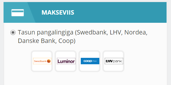
Kodumasin.ee shopping cart gives you four choices to choose in between different banks to pay for the goods. Unfortunately the icons identifying the bank’s brand…
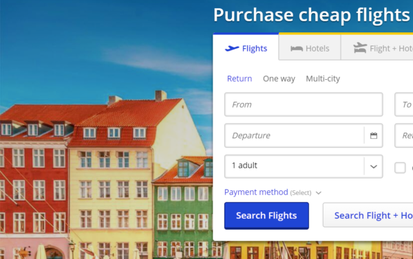
Norwegian airlines started its email campaign for cheap flights with a link from its email newsletter (“Autumn sale is on” image area) to a broken…
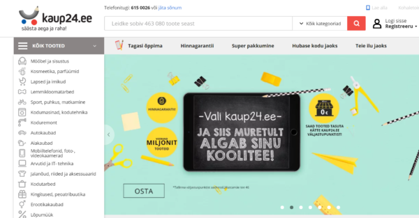
Kaup24.ee shopping cart is again content heavy and therefore hard to gasp. A few details add clutter and slow down the shopping process for getting…
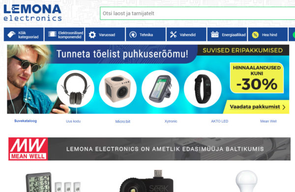
Lemona checkout process has many caveats. First of all the most problematic issue becomes evident when you are not a client but must become one…
If you offer a form to fill in information for a payment order then you should allow user to see what kind of information is…
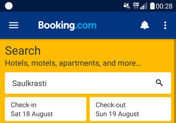
Booking.com APP’s (for Android) most important form field is the search field where you enter the search string for example a city or a hotel…